

In November 2010, I posted the original “Wealth Distribution for Dummies.” As the election approaches, an updated version, reflecting the shift in wealth ownership since the end of the recession, seemed appropriate. Also, given how the distribution has become even more skewed, I figured a remedial session couldn’t hurt.
This is very straightforward. I’m going to let 100 people represent 100% of the U.S. population, and $100 represent the country’s wealth. One person will represent the top 1% of the population. The next 19 people are the rest the top 20%. The other 80 folks are the bottom 80%. Now let’s distribute $100 accordingly.
One person (above), gets $35.60 all to him/herself.

Ouch! That's quite a jump. That's one-thirteenth of what the super-rich guy has! No wonder regular rich folks don't think they should pay more taxes. Together these 19 people own $51.60. That's about half of the $100. The top 20% as a whole, owns $87.20 of the $100.

But wait! Here’s something to make them feel better.

As a group, their total share of the $100 is $12.80. The 19 rich folks each have 17 times the wealth of each of these 80, and for the super-rich guy, it's a factor of 223. (So when Romney wanted to make a $10,000 bet with Rick Perry at the debate between the Republican candidates, it was the same as a regular guy offering to wager $45.)

New York Times columnist, Nicholas Kristof recently wrote about the topic of wealth distribution and very effectively had us imagine 100 kindergarteners sharing toys according to how wealth in the U.S. is actually distributed.
One avaricious little boy is jealously guarding a mountain of toys for himself. A handful of other children are quietly playing with a few toys each, while 90 of the children are looking on forlornly — empty-handed. The one greedy boy has hoarded more toys than all those 90 children put together!
Naturally, I was curious to see what toys can be purchased at the $35.60, $2.72, and $0.16 levels.
For toys under 20¢ you are on the low end of party favors bought in bulk. So things like a tiny cupcake-shaped eraser, or a mini pencil is all you can hope for there.

Even the $2.72-level is not really all that thrilling for toys. Think basic water gun or a yo-yo.

For $35.60, however, there’s tons of stuff. Remote-control helicopters, fancy super-soakers, electric guitars, microscopes, and in the $25-$50 range for Lego, look what’s for sale--a White House!

The $50 price tag is tad out of reach for poor little rich boy. He will have to use a line of credit, or borrow from the other kids to make up the $14.40 he doesn’t have.
Believe it or not, there is good news for the 80 kids with mini erasers. The one super-rich kid only has one vote, and the next 19 kids only have 19 votes. But the 80 kids have 80 votes. That's four times the votes, the 20 rich kids have.
DON’T WASTE YOUR VOTE BY ...
1. NOT VOTING
2. VOTING FOR SOMEONE
WHOSE ONLY INTEREST IS GETTING
HIMSELF INTO THE WHITE HOUSE
What got me started on trying to represent this disparity in wealth in the first place, was the study published a couple of years ago by Michael I. Norton and Dan Ariely about just how clueless Americans are as to how wealth is actually distributed in this country. Kristof also refers to the study and wonders if “perhaps nothing gets done because, in polls, Americans hugely underestimate the level of inequality here.”
I will spare you my rant from the original WDFD post, but I place a fair amount of blame for the warped perception of the American public, on the conventional data visualization used for charting wealth distribution. Below is a version of such a chart from the Economic Policy Institute.
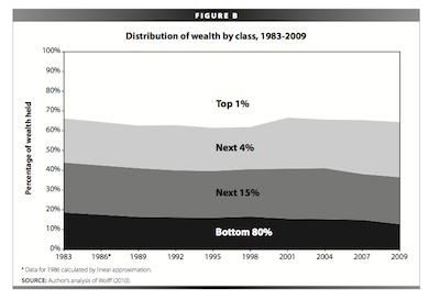
The image we see (and retain) is of the gently decreasing
bands of wealth from top to bottom. But
we must read (and mentally imagine) what is most dramatic about the chart,
namely the vastly incomparable populations being pictured (1%, 4%, 15%,
80%). You can read the original rant
here.


