It’s probably the only coloring book that assumes the owner has multiple residences and leaves five spaces to list them right on the cover. That’s because The Marcel Breuer Coloring Book (c. 1960) was not for kids, but rather for the staff of
Marcel Breuer Associates. The hand drawn pages inside, are filled with inside references to firm projects and personalities.
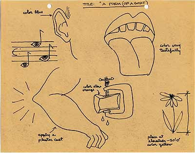
The drawings and cryptic text make humorous reference to various Breuer projects, colors, materials, and working methods, such as the Unesco Building in Paris, Cesca and Isokon chairs, his use of stone and concrete, and "Breuer Blue.”
Lorry Roeder, who donated the coloring book to the Smithsonian Archives of American Art, writes that he started work at the Breuer New York office in 1963 and upon the firm's moving offices, “Mr. Breuer had me clean out, and throw away, all of the contents of a 4-drawer file cabinet that stood next to my desk. He told me that I could take anything as long as it left the office. Which is how I received the Marcel Breuer Coloring Book."
It is not known who wrote and illustrated the work. You can see a larger, albeit heavily watermarked version of the coloring book in its entirety
here.


TEXT: FIND THE MISTAKE AND COLOUR IT RED, WHITE & BLUE.

TEXT: The man who drew this is no longer with us. WHY? (use vermilion “116” pencil)


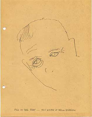
TEXT: this is so restful. Color my suit a restful charcoal brown, put a martini in my hand, add a bit of hair

TEXT: I am a fireplace; one specific fireplace; I am not always this shape but I am concrete like others so please bush-hammer me with all of your might: bang! bang!

TEXT: ARCHITECTS LIKE PEOPLE …COLOR THIS PERSON NICE
HE IS A CONTRATOR … COLOR HIM REAL NICE

Follow the dots and see if it lays an egg!

COLOR KEY: R=RAPID RED, S=STERLING SILVER, B=BREUER BLUE


They are thinking of building this in the middle of Paris
(Color it in weathered steel)

WE HAVE A LOT OF FUN WITH THESE
SEE IF YOU CAN THINK UP SOME MORE. TEL US ABOUT THEM.


erry x…
 Some shots off the TV of a restored version of F.W. Murnau’s Nosferatu. The 1922 German film, featuring stage actor Max Schreck, was an unauthorized adaptation of Bram Stoker’s Dracula. When Stoker’s widow won a copyright infringement suit in 1925, it was ordered that all prints of the Expressionist film be destroyed. But as vampire-movie expert Tim Kane notes, “the undead film continued to rise from the grave throughout the years.”


 Happy Halloween!

